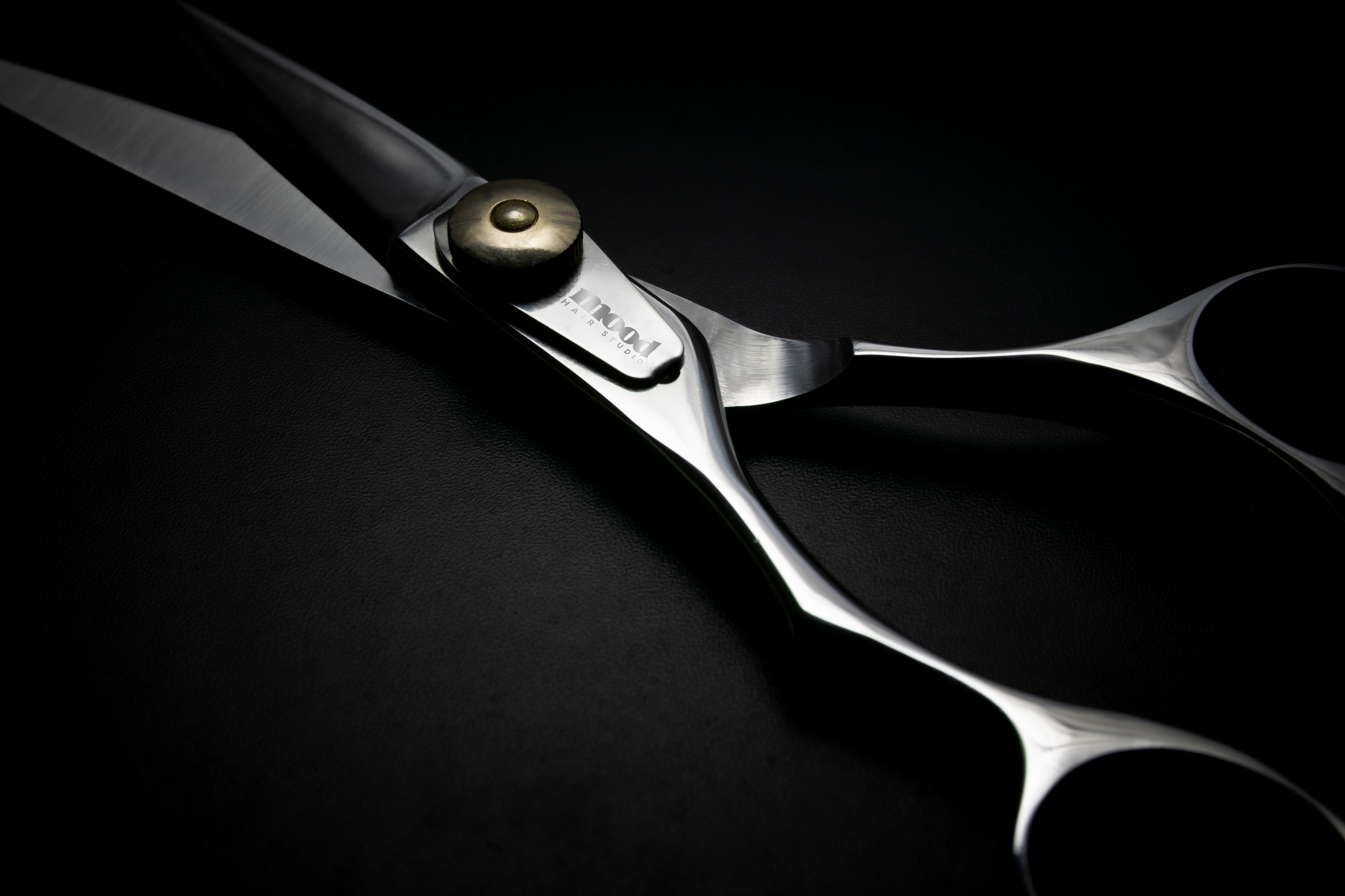
World-class work,
invisible brand.
Mood Hair Studio had a cult following in their neighbourhood. The stylists were exceptional, the environment was warm, and clients booked months in advance by word of mouth. But their visual brand was a decade behind where they were as a business.
The old logo didn't reflect any of that. It needed a mark that felt as considered and editorial as the work happening in the chair, without losing the personality that made Mood, Mood.
Precision meets
expression.
Great hair is a precise craft, but what people feel in the chair is pure expression. We built the brand on that tension. The visual identity had to feel editorial and intentional (like the stylists) while staying warm and personal (like the experience).
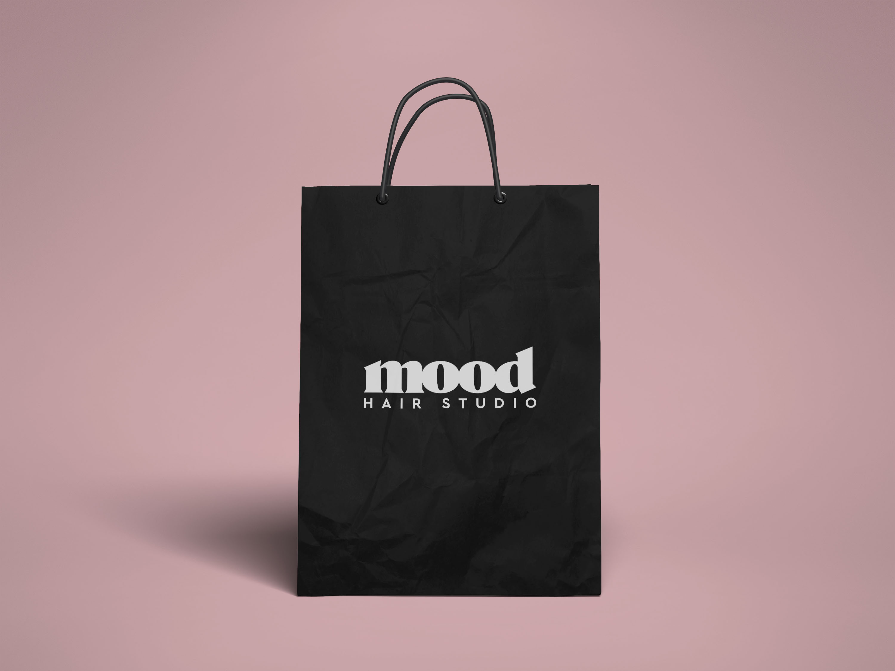
We landed on a colour system anchored in a soft, powdery pink against deep charcoal, unconventional for the industry, immediately ownable. The typeface pairing brought editorial weight to service names and menus without feeling cold.
"The brief was: it has to feel like us on our best day, but turned up. We got exactly that."Studio Owner, Mood Hair Studio
A mark that
holds up.
The brand audit and discovery sessions surfaced the real brief: the studio didn't need reinventing, it needed a logo that could keep up with it. Everything came down to one mark doing a lot of work.
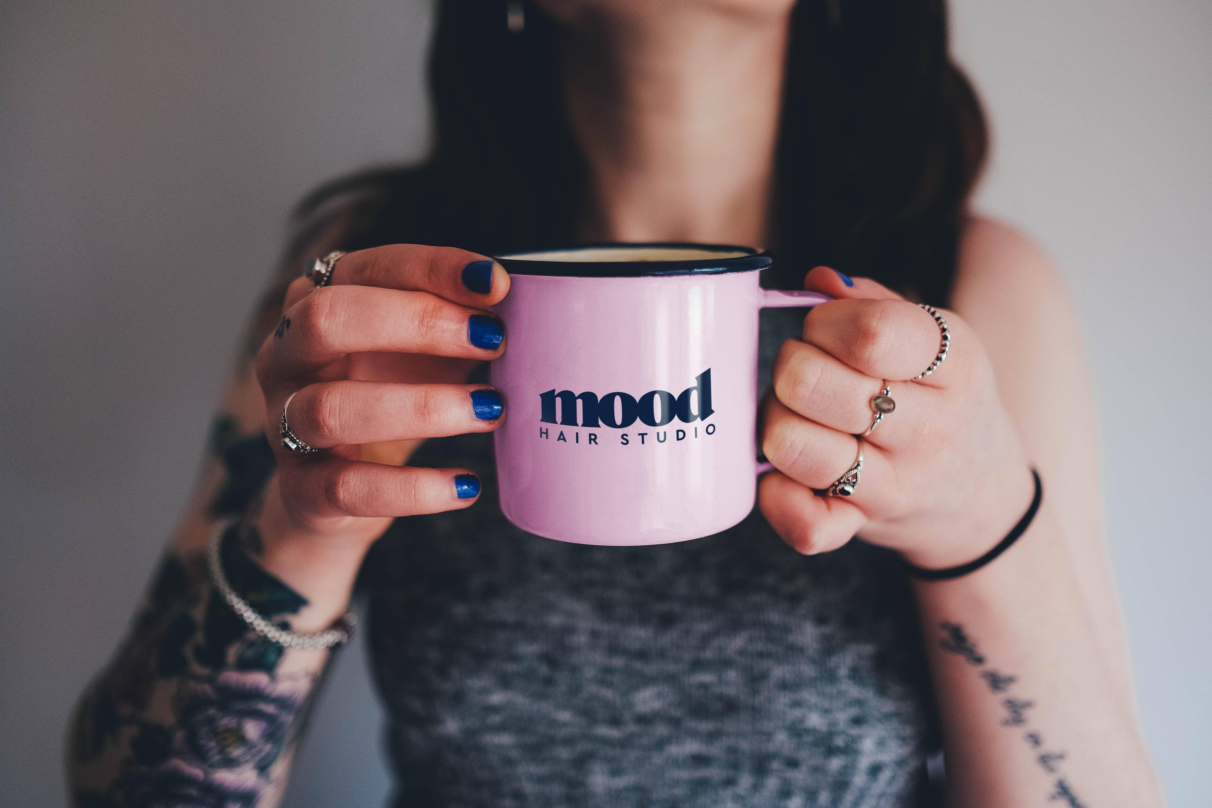
The wordmark was built to read at signage scale and just as clearly on a mirror decal or a business card, monochrome or full colour, without ever losing its warmth.
A mark the
studio can grow into.
Mood now has a logo that matches the calibre of what happens in the chair, one mark the studio can carry across signage, social, and every future touchpoint without it feeling like an afterthought.
It's a single-location studio today, and this was scoped as exactly that: a solid identity foundation, not a full rebrand, with room to expand the system later if the studio does.