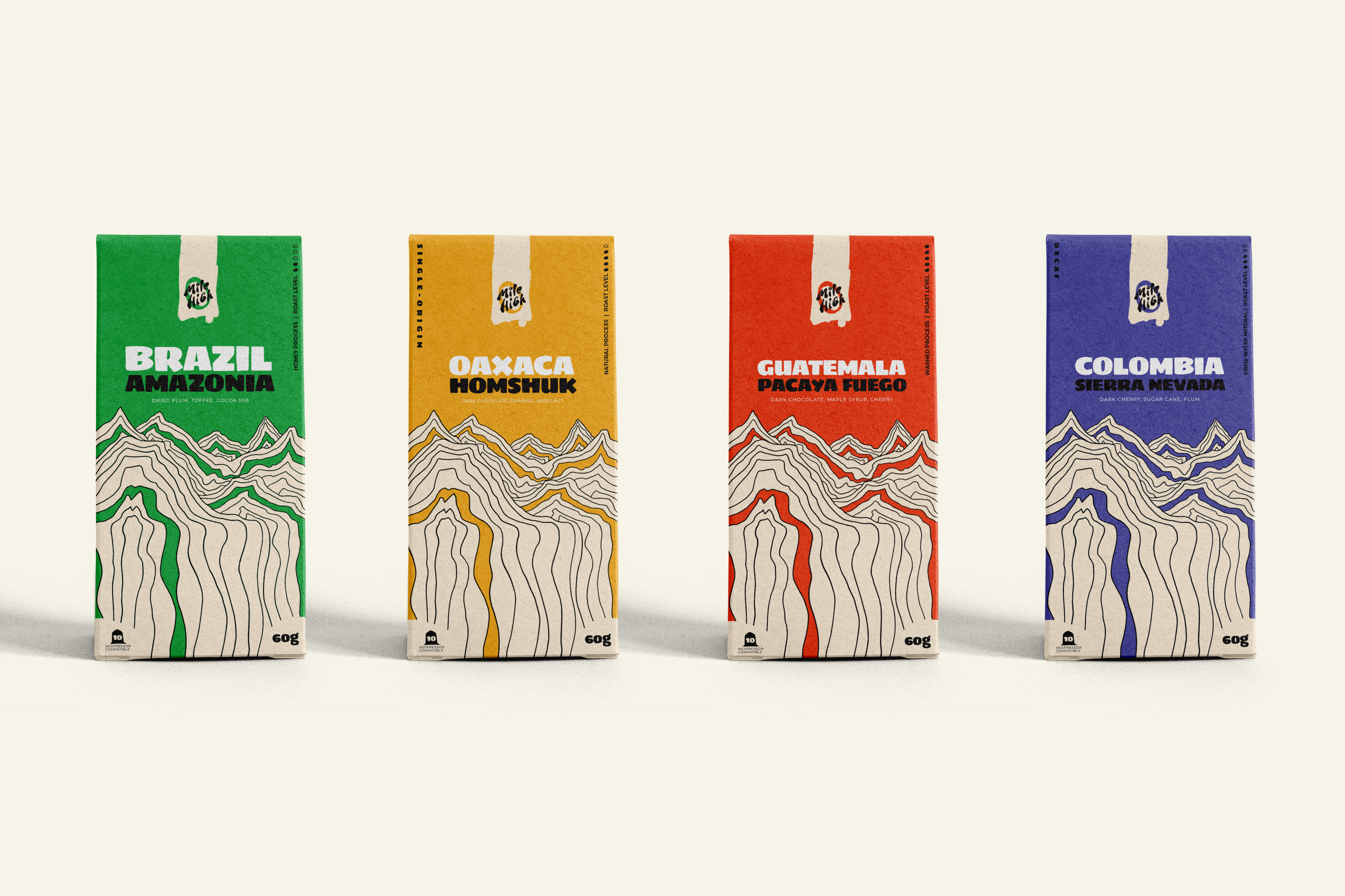
A great roast
with no story.
Mile High Coffee Club had a product people loved. The single-origin sourcing was meticulous, the roasting craft was real, but the brand looked like a template. Generic fonts, a forgettable logo, and packaging that disappeared on a shelf full of competitors doing the exact same thing.
The founder knew something was off but couldn't name it. Customers were coming back, but not bringing friends. The brand wasn't giving people anything to share.
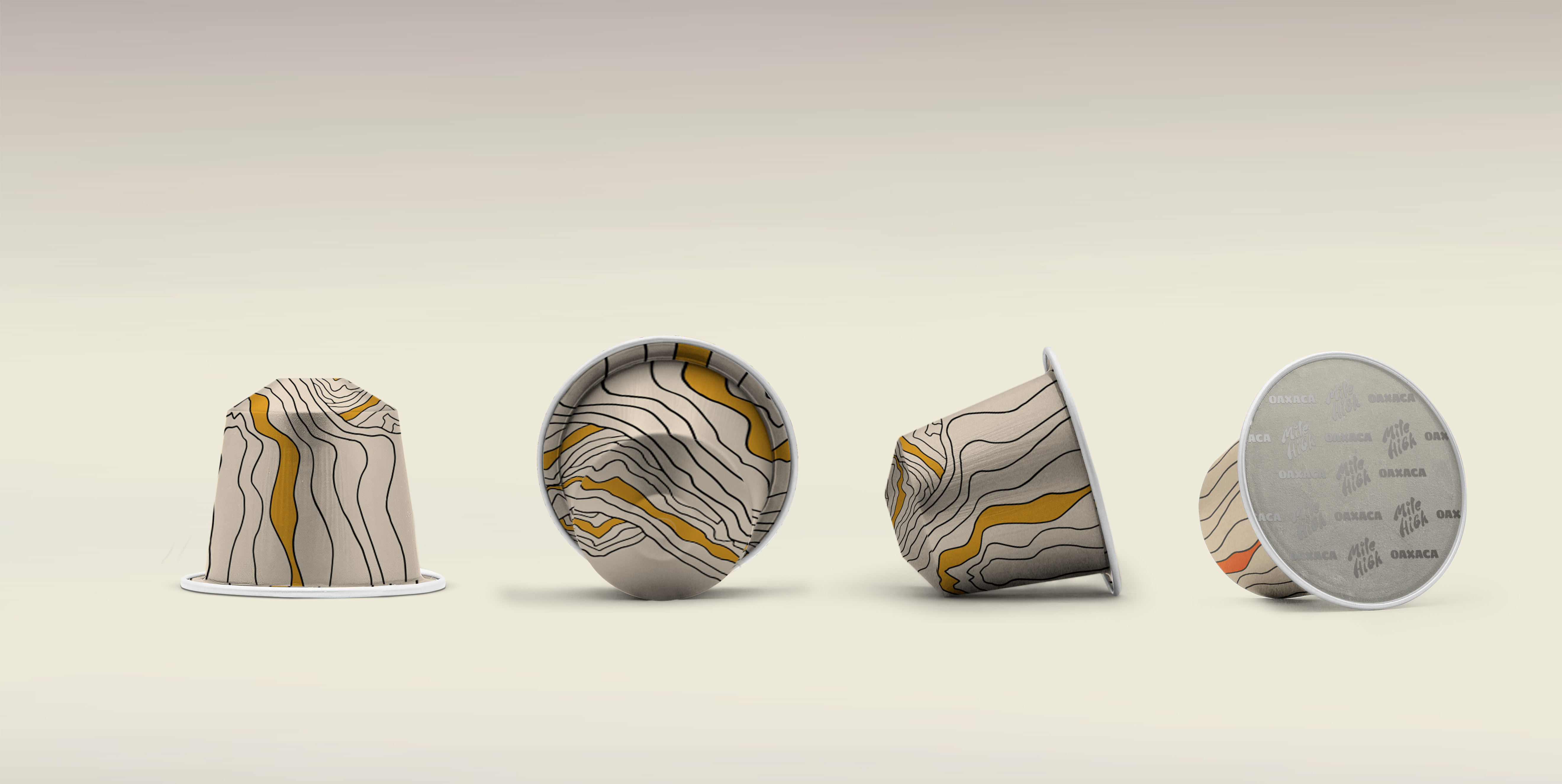
Adventure rooted
in craft.
The insight was simple: specialty coffee drinkers aren't just buying beans. They're buying a ritual, an identity, a story. Mile High's audience was the outdoorsy, quality-obsessed consumer who sees their morning brew as the first act of a full day.
We positioned the brand around altitude as metaphor: the pursuit of higher ground in everything. Better sourcing, better craft, better mornings. This gave us a rich territory to build from: one that was ownable, and true.
"The brand insight was right there in the name. We just had to build the world around it."Mike Moreno, Rebel System
From word
to world.
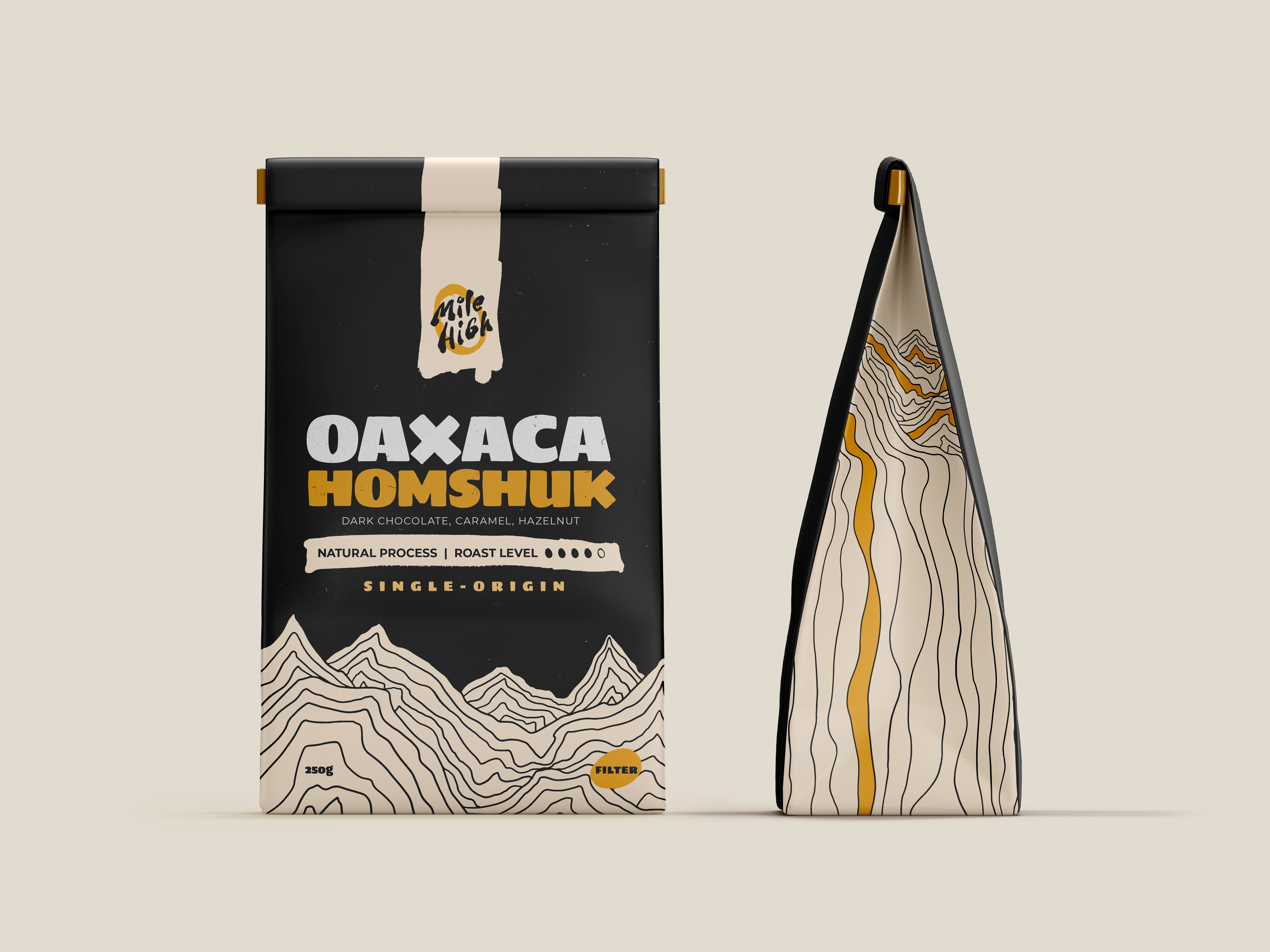
We spent three weeks just on positioning: nailing the tone, who this was really for, and how it should feel to hold one of these bags. The visual direction came after clarity was locked. A wordmark built on compressed, confident typography that evokes altitude. A colour palette of deep espresso browns, burnt orange, and natural cream.
Packaging became the hero application. With so much purchase decision happening in-store, we designed each bag to read as a billboard. Bold. Confident. Impossible to miss.
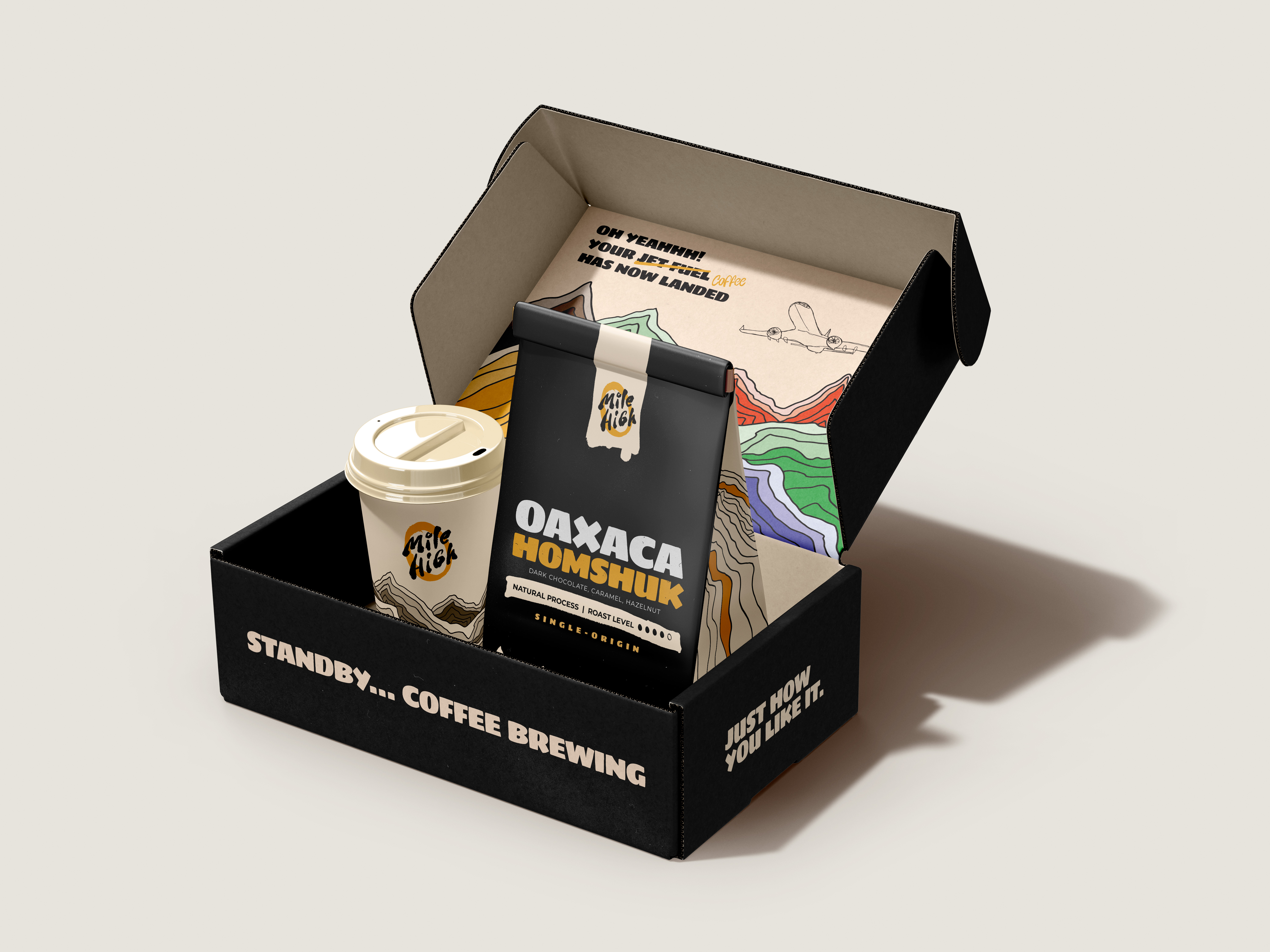
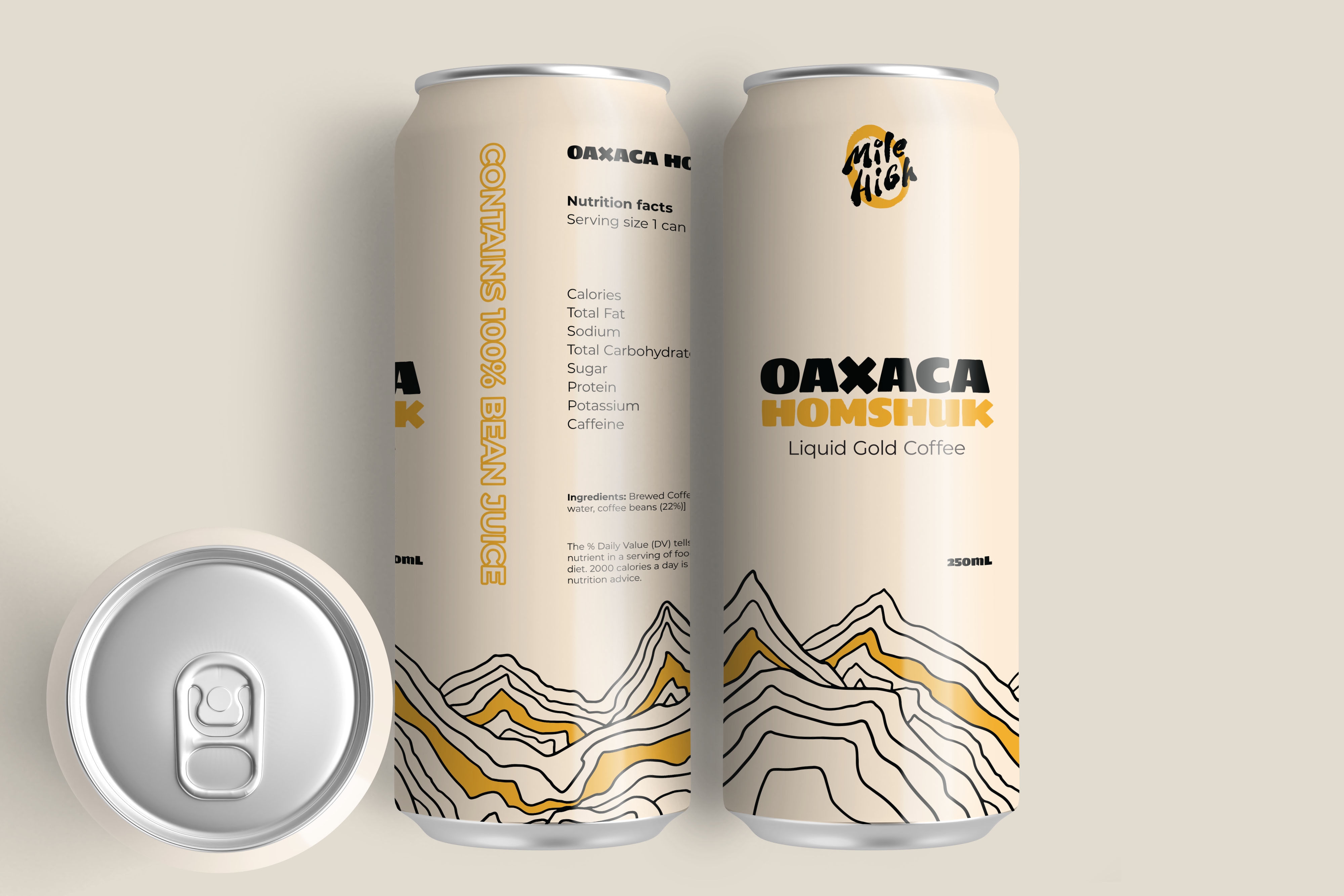
A brand that
earns attention.
This one's a passion project, so the numbers below are goals rather than reported results. The bet: sharper packaging turns a shelf-blender into something worth photographing, worth stocking, and worth telling a friend about.
The real win is a brand the founder can put next to any competitor without flinching, and one that gives customers something to be a little proud of picking up.